

︎︎︎ Tändsticksask
The afternoon of January 3, 2022 where myself and my flatmate were invited to visit our friend Emelie Jannerlöv in Karlstad, Sweden. On this day, Emelie invited us to her soon-to-be apartment, which was previously owned by her grandparents. The apartment is along the water of Gamla Stenbron (Östra Bron), translating to ‘Old Stone Bridge’. The bridge was inaugurated in 1761–1811, being the longest stone arch bridge in Sweden at 168m. Upon entering the block of apartments, we were presented with the smell of third-hand smoke that had been gradually accumulated on the surface the ivory-patterned walls in the hallway. Rather than scowl at it we laughed and said it added character, and we continued reach the apartment where Emelie—med glädje—invited us in. Upon entering, I could see the few boxes left of her grandparent’s belongings placed in the living room. We were given a tour, and spoke of interior and decorative ideas for Emelie’s move-in. While conversing, I often trailed off noticing old wooden Swedish board games, faded photos, and worn but delicate books. Emelie lead us to a storage room—here, she began to sift through boxes of memories and items stored by her grandparents. She had explained to us that many of these items belonged to her great grandparents. It was at this point where Emelie offered me a box and followed the action by saying, ‘Hey Eden look at this, I have a feeling you’re going to love this’.
She was right—and I was entirely unaware of the treasures which she had just placed in my hands.
 The box was filled—and to me—simply rich with life, emotion, and Swedish culture. Inside the box, and what I first picked up, was a copy of the New Testament. The pages cut with a golden-metallic trim, with a select few bookmarked pages. Alongside this was a pocket calendar from 1926 with Swedish name-dates written inside. Close to this was a well-kept illustrative copy of the Breton fisherman’s prayer, dated 1927. To follow was a handful of opened letters that had been placed back inside their home envelope, written in mostly blue ink or pencil that conversed about army training and home life.
 I then explored the contents of an old wallet, inside were food ration coupons with a capitalised white rounded san-serif title reading: ‘STATENS LIVSMEDELSKOMMISSION’ translating to ‘STATE FOOD COMMISSION’, dated 1943–44. There were other objects in the box including an old shaving razor, pin-badges typographically decorated with ‘Stockholm’, a pair of old reading glasses, military documentation, and photographs of a trip to London taken place sometime during the 80s. Emelie explained that her relatives often went to a cottage for short holidays during summer, photos to reflect this showed a family dressed in white eating on a table of neat décor in the sun of a field in the countryside. The contrast of the black and white photo was charming, the white clothing against the shadows offered by the sun looked serene to the point at which it did not feel real at all, perhaps more like a dream or a thought rather than a real setting.
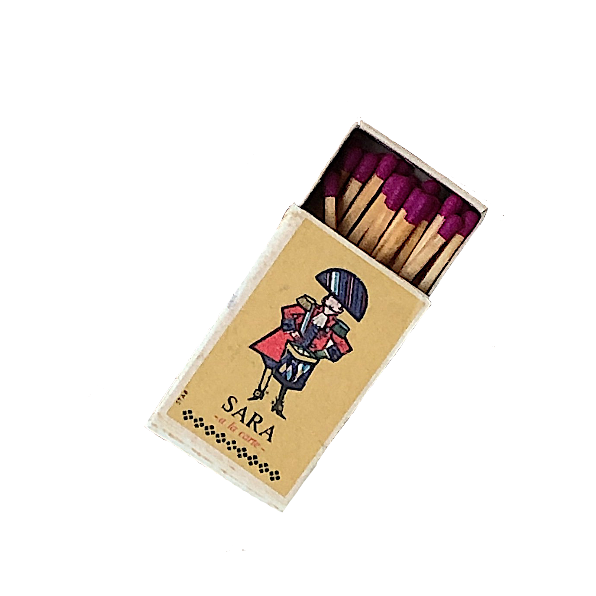
At the bottom of the box Emelie handed me, lied a matchbox. I see vintage matchboxes all the time in London’s markets; the outside often looks beautiful but worn but there are never any matches inside. I do not want to buy a vintage matchbox for its cover alone, I want to buy it because the inside works in harmony with the outside. And so, when I saw this matchbox at the bottom of the box, I knew there would not be anything inside; in fact, I was quite stubborn about it. I almost did not want to open it because I felt that I already knew it would be empty. When I moved the matchbox to the side to see if there was anything else of interest beneath it, the box rattled. No… surely not? The cover of the matchbox was titled ‘Sara — À La Carte’ Presumably tied to a restaurant or hotel. Illustrated on it was a drummer boy, burgundy and blue in colour; placed on the golden base of the matchbox. When I opened the matchbox inside was filled with every match, like a complete puzzle, not a single piece missing. I soon noticed the beautiful purple-red colour of the matchheads. At first, I thought perhaps my eyes are deceiving me as I am used to the common dim-red colour of a match head. I realised I was wrong; that their colour has been tailored to suit the aesthetic of the box: Designers galore.
 British pharmacist John Walker invented the match in 1826, by accident. He was working on an experimental paste to use in guns, until he scraped the wooden instrument that he was using to mix the substances in his paste, which ultimately caught on fire. Other than soon selling what he titled as friction lights to locals in 1827, Walker never patented his invention as he saw too many flaws in the design. His invention was soon copied by Samuel Jones, who started selling lucifers in London, 1829. The experimentation of matches included white phosphorus and advancements in their design continues over the 1830s–40s. It became a common trade in England, with factories increasing their production numbers for matches. Matchstick making held a specific risk in the factories however, known as phossy jaw (Eschner, 2017). The result of inhaling white phosphorus fumes lead to the bone in a person’s jaw to die, and teeth to decay after roughly 5 years of exposure.
 It was not until 1836 where the first match factory in Sweden began to operate. The factory was based in Stockholm, called J.S. Bagge&Co. In 1844 Swedish professor, Gustav Erik Pasch worked out how to prevent matches from igniting against any surface by splitting the chemicals in the match head and putting the phosphorus on a separate striking surface on the outside of the box. This is known today as the invention of the safety match. In the following year of 1845, Swedish brothers Johan Edvard and Carl Frans Lundström began to manufacture matches in Jönköping, improving and trialling Pasch’s patent. These were soon presented to the public in 1855 (Anastacia Sampson, 2015).

After finding the first matchbox from Emelie’s memory box, the neighbouring memory boxes also had scattered within them more vintage Swedish matchboxes. The next one I found was black-outlined caricatures of Swedish politicians on a white base, with black coloured matchheads. Written on it was ‘Det gick inte... inte det här heller’, translating to ‘It did not work… not this one either’ to reflect not only the politicians, but because we fuck up the simple action of striking a match time and time again. After diving into research and asking my flatmate for a lot of Swedish-to-English translation, we found that the political side to this joke was entailed by the left party as an advertising component in the leadup to an election. A satire approach to reflect the poor government of middle-right and right political parties.
Another matchbox buried at the bottom of the memory box prominently had titled on it ‘TÄNDSTICKOR BRUKSASK’, translating to ‘MATCHES UTILITY BOX’ decorated with three linear stars on the box. It was difficult to find an exact replicant of the matchbox online, but soon found some insight in relation to the three stars on the box. Famous export brand Three Stars, uses the number three as ‘a lucky number… The word and the symbol of a star are traditionally associated with quality’ (Swedish Match, 2022).
The other matchboxes I found were perhaps less significant in the history of matchboxes but were still beautiful in design. My favourite find of that day was the Stockholm Twin Tower Hotel matchbox. A radiant blue design layered on top of an ivory base with ‘Twin Tower Hotel’ titled in small caps; interrupted with small yet detailed prints of the hotel’s tower structure.
What I enjoyed most about looking through the matchboxes were the coloured matchheads. Some matchboxes simply had no writing on them and would be adorned with illustrations, and colourful inside with bright blue, purple-burgundy and piercing black varieties. The head of safety matches are made of an oxidizing agent such as potassium chlorate, mixed with sulfur, fillers and glass powder. The side of the box contains red phosphorus, binder, and powdered glass. The heat generated by friction when the match is struck causes a minute amount of red phosphorus to be converted to white phosphorus, which ignites spontaneously in air. This sets off the decomposition of potassium chlorate to give oxygen and potassium chloride. The sulfur catches fire and ignites the wood (University of Washington).
It has become apparent to me that Designers steadfastly attend to and notice detail. We are satisfied by items that may feel frivolous to some. As I began to take photos of the matchboxes, I asked myself: Is this me having an eye for things as a designer, or am I just weirdly excited about a matchhead being blue?’. My eyes were drawn to the composition of the boxes, my hands to the tactility of the boxes, my mind to the thought of where these boxes came from, how they were given, and who designed them. Questions upon questions made me think ‘I must write a bloody essay about this, even if it’s only a couple hundred words’ (I have currently written 2000+ words). Nevertheless, my subtle excitement filled the room as I held artisan treasures in my hand,
my friends looked at me as if I had struck gold—
until they realised that it was just a matchbox.


Eden Malik
/ Projects
Works
The Golf Belt
Extended Senses
Paradise Lost (ISTD)
Book of Scribbles
Cyprus Short Film Day
School of Design
/ Case Studies
Go Crazy
Halftone
Nature of Code
Experiential Spaces
/ Collections
Posterfolio
Spray Paint
/ Photos
June
January
Childhood Lens
Karlstad
Stockholm
Gracias vida
/ Contact
︎︎︎ Information
︎︎︎ Linkedin
︎︎︎ Pinterest
︎︎︎ E-mail
Eden Malik
/ Projects
Works
The Golf Belt
Extended Senses
Paradise Lost (ISTD)
Book of Scribbles
Cyprus Short Film Day
School of Design
/ Case Studies
Go Crazy
Halftone
Nature of Code
Experiential Spaces
/ CollectionsPosterfolio
Spray Paint
/ Photos
June
January
Childhood Lens
Karlstad
Stockholm
Gracias vida
/ Contact